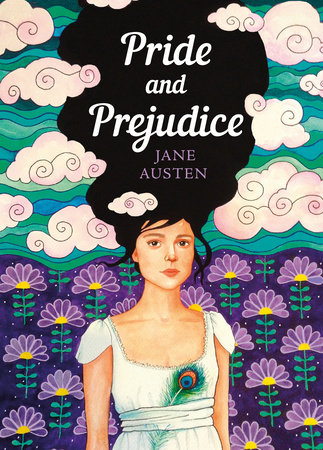
This week, the book-reading internet was apparently in a mild uproar over six redesigns of Jane Austen novels, which will be published—with new introductions from popular contemporary YA romance novelists like Ali Hazelwood and Tessa Bailey—by Puffin, Penguin UK’s children’s imprint, in March. The series, which Puffin is calling First Impressions, is geared toward introducing younger readers to Austen: “Fall head over heels for First Impressions, Puffin’s boldly designed new Jane Austen collection for young-adult readers,” the promotional copy reads. “Full of meet-cutes, missed connections and drama, this eye-catching six-book series is an open invitation to embrace your inner romantic.”
Before we go any further, here’s what they look like:
 Puffin Books
“It feels a little bit patronising,” wrote one reader on Reddit. “When I was young, back in the stone age, I used to hate it when things were written to be ‘cool’ and ‘let’s appeal to the kids’. I always felt I was being talked down to, and it made me cringe. In this case, I can’t help but feel that readers with absolutely no prior knowledge of Austen are going to feel a bit deceived.”
Looking at these, I’m reminded a little, too, of Barnes & Noble’s 2020 scheme to rebrand a series of classics as “diverse” by simply switching the races of characters on the covers—an effort that was widely condemned as superficial and insulting, and which was quickly suspended. (Though I will say these covers are nowhere near as bad as those, and also hit a little different in a post-Bridgerton world.)
On the other hand, if pink book covers get more young readers into Jane Austen, an ancestral gateway into Serious Literary Books, isn’t that an overall good? And after countless film adaptations—especially the poppy modern ones—will they really be all that deceived? Does it even matter what, or why, people read at all?
Well, whether it actually matters or not—and nothing really matters, but don’t get me started—despite the fact that we’re told not to judge books by their covers, we do. Like the clothes you wear (as Austen herself would confirm), a book’s cover does—or at least can—change our perception of it, even after it’s been read. Book covers can provide a kind of tonal context, or at least give the reader some hints as to how its publisher wants the text to be understood. It’s easy, despite that, for a great book to transcend a dopey cover—many have done this—but it’s also possible for a great cover to elevate our experience of a dopey book. A little, anyway. Perception being, after all, reality.
That said, cover treatments for Austen novels that seek to appeal to young people aren’t particularly new. Here’s a nice one from Puffin Classics Canada:
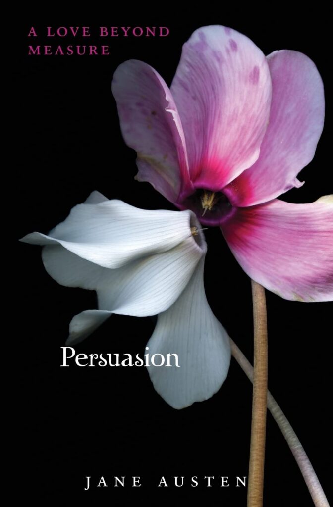
And here’s an edition of Persuasion explicitly marketed to young readers of—you guessed it—Twilight, published by HarperTeen in 2010:
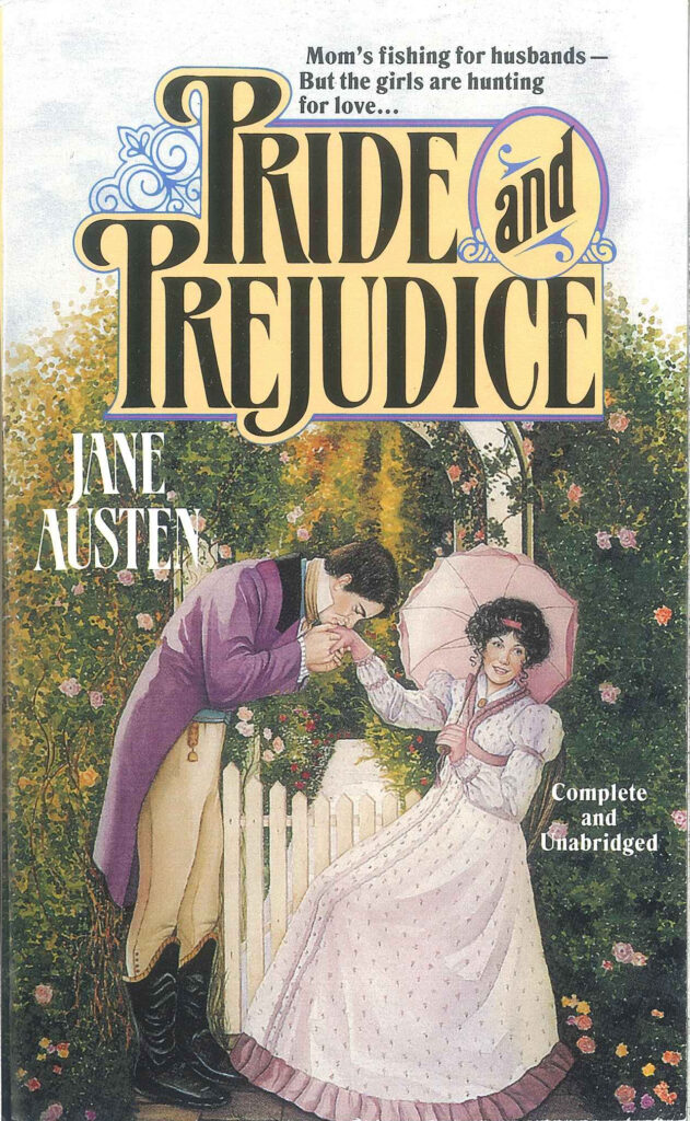
Nor is it the first time that Austen’s novels have been aimed at romance readers. (Whether Pride and Prejudice is actually a “romance novel” is up for debate, I suppose.) Here’s a version from TOR Books that I came across at Digital Austen:
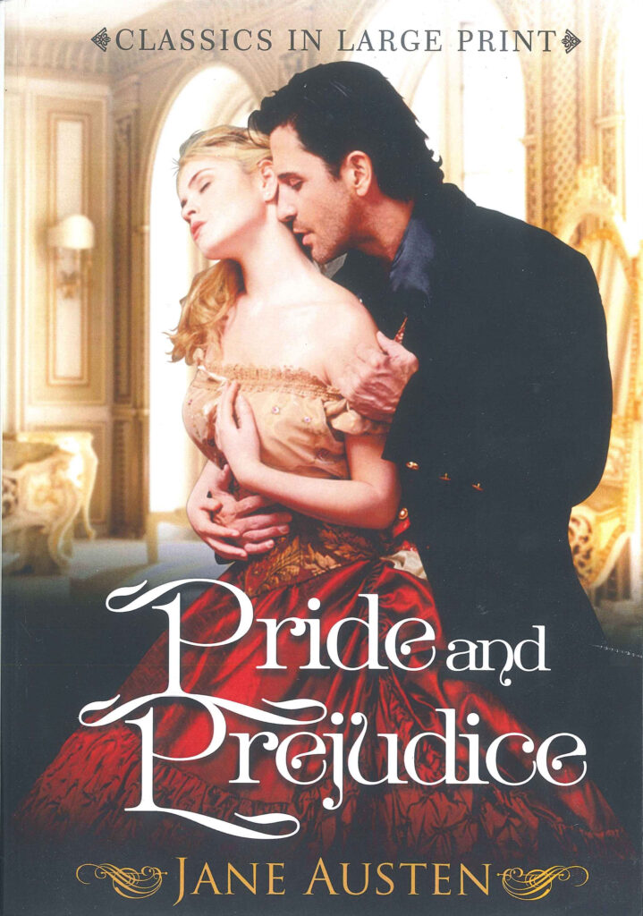
And one from a 2017 large print edition:
So I wonder: what exactly do we think Jane Austen’s book covers should look like, and why? There are already zillions of covers of Austen’s works (yes, this is a precise sum) ranging from the gorgeous to the objectively terrible; after all, these are in the public domain, and have been for a long time. Anyone who wants to can republish them with whatever cover they made in Photoshop that day. Still, we are used to a certain kind of Austen cover. Funnily enough, Penguin UK alone publishes at least five other sets of Jane Austen’s backlist, all different editions with different covers. These basically fall into two categories: either patterned, like Coralie Bickford-Smith’s lovely clothbound series…
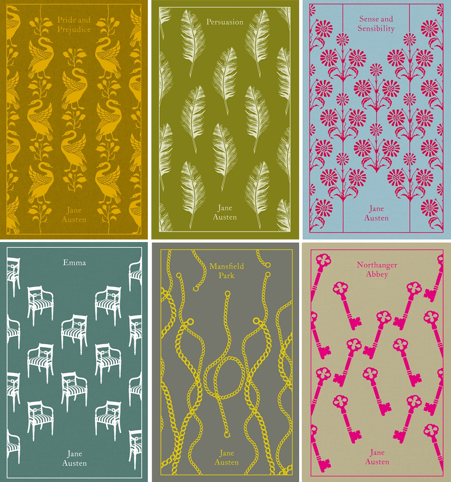 Penguin Books UK Clothbound Classics; designs by Coralie Bickford-Smith
….or using a more workaday template, featuring an historically accurate (or at least, shall we say, “old-timey”) image along with some formal text—the editions you probably encountered in high school:
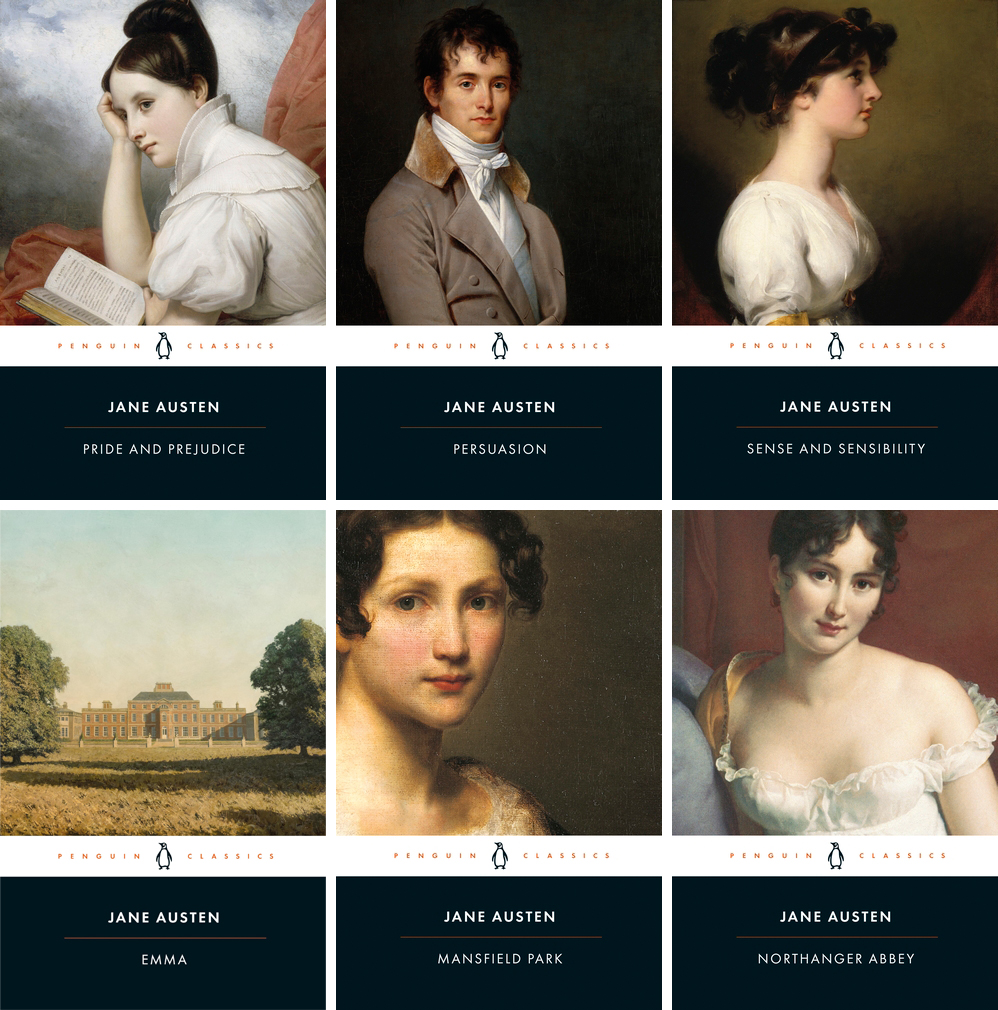 Penguin Classics editions
Both approaches have their merits, but in my view, and perhaps this is because the books have been primarily marketed to women, none of them are particularly groundbreaking from a design standpoint. So maybe Austen’s books really do speak for themselves—they have remained, and likely will remain, beloved classics no matter how they’re dressed.
Other readers on the same Reddit thread about the new Puffin covers described the YA-coded art as “disrespectful,” which suggests that they think Austen’s work deserves a different kind of cover: a cover that befits the literary quality, or the seriousness, or the cultural importance, or simply the beloved-ness of each book, perhaps. Others have also pointed out that publishers would never do this kind of rebrand with a male author’s books, which is likely true—though they’d have little incentive to do so, considering the demographic they’re aiming for, and honestly, if they thought they could make money doing it, they probably would. And again, since there have been so many different covers of Austen’s books already, it seems to me as though yet another attempt to market them to teenagers doesn’t quite reach disrespect territory—even if it is an attempt at a cash grab, which it is. Who other than Jane Austen understood the importance of money? And let’s not forget that the more cash Penguin can grab selling pink Jane Austen books, the more they (might) have for publishing your Important Literary Debut Novel.
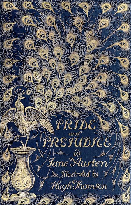
Which is not to say I particularly like these. They are, as the kids might or might not still be saying, not the right vibe at all. So just for fun/the record, here are two I do like very much: the cover for the first fully illustrated edition of Pride and Prejudice, published by George Allen in 1894, and designed by Hugh Thomson, which I maintain is one of the most iconic book covers of all time…
…and this one, which might be my personal favorite: an edition of Northanger Abbey from 1965, and just one of many pulpy-covered classics that I love:
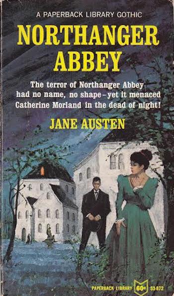
If I’m remembering it correctly, the terror of Northanger Abbey is just…Catherine’s overactive imagination and generalized anxiety, right? So I have to say that it this is pretty accurate.
Now tell us: what are your favorite Jane Austen book covers? Drop them in the comments, please.